
The colors are rich and pattern and shine are plentiful. Lipstick is dark and shoes are metallic. I kind of like the overall tone, even if it seems ornate and taking itself quite seriously, with full-on shiny glam.


And who can escape the charm of shined-up equestrian chic? You can go on a date straight from your afternoon horseback ride, just kick off your riding boots...
But seriously, I quite like the looks. I am all for dark costume dramas. I just don't lust after individual pieces. Either I already own them (navy blazers, tweed capris, leopard), or find them very hard to pull off personally (hello rug print sweaters). I would wear the shoes, but I feel like I can find more comfort for the price.

Too bad I could not wear the lilac shade. But it still works, I admit.

Another monochromatic look that I am digging. Love it, in fact. However, I can try to recreate it with what I already own. The multicolor Biennal is quite fetching, too.


OK, I do want that sweater. Looks super cozy and comfortable. Would go with everything. Hope this is not made from acrylic blend.

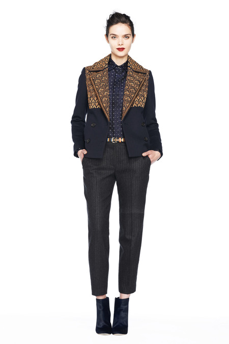
I hate the shoes, sorry. I also never cared for the tipped hacking blazers. Well, I lied. I bought them twice and sold both. And nobody would convince me to wear shorts with my blazers. Especially in the winter. But I like the blouse. I think this is a cami and I can already see it with my blue and burgundy pieces.
Overall, I am glad to see the deep color mix and that the burgundy is not going away. Neither are the patterned capris but still, I am not convinced I should get them.
In the end I decided I need two items: metallic heels and bold flowered blouse. Not necessarily from J.Crew.
***
That's all folks!
What's your take on the Fall 2013 collection?
Please share, it would be no fun without you!!!
Ha! I could hear the odd meow in there!
ReplyDeleteMy issue is always the disappointment when I see the real pieces! But I cannot tell if it is them or me? Are we breaking up or am I taking a time out? Did it start out as a torrid love affair and fizzle to the odd soulless tryst? WHo can say!!
It is not you definitely. Only time will tell, but it seems we are separating. Maybe we can still be friends?
DeleteThanks for sharing the pics. Quite a few items look like Collection pieces, not in my budget. I do like the rich, dark colors.
ReplyDeleteEverything seems to be Collection nowadays, but it does not mean better quality or fabrics, just the price :(
DeleteI like the long leather gloves but I already have a pair. Your floral blouse pick is pretty. I think the white pants are diaper-derivative.
ReplyDeleteThanks for sharing your picks and pans. I do like checking everything out even if I am not excited in the least about shopping JCrew!
Diaper-derivative...LOL! I did not even notice the odd bulky pleating on the pants until you pointed it out.
DeleteHAHA about the diaper pants, ITA. I hate 'drapey' pants.
DeleteI share your love of Oilily. As long as I'm not seeing shoulder pads (cringe) in the silhouettes of the grey top (monotone pant outfit) and jackets I am very excited about the fall preview. I could not take another catalog filled with fall/winter pastels and pops of neon. Love the mix of deep colors, texture, pattern and shine (and I'm not one to wear much "shiny" anything). With the exception of the shorts, these are familiar looks that I have worn over the years that have been very flattering and comfortable. I have some old Eileen Fisher pieces that have the same proportions as the lovely white sweater/pant ensemble and enough J Crew capri's sweaters and blazers to create a base for the look. I'll be looking for just a few key accessories from J Crew in the fall as long as the quality is there. No acrylic.
ReplyDeleteYou are right, in the winter I crave dark and jewel tones, or maybe neutrals but definitely not pastels and neons. I am sure your EF pieces are better quality than almost anything
DeleteJC churns out recently.
Thanks for sharing but not loving the looks aside from the darker colors and the shoes. I feel like the Jcrew stylists are watching re-runs of the Cosby Show for inspiration. As a tall, bigger boned girl -- extreme pattern mixing makes me look like a clown. Oh well I will keep going shopping at Nordstrom and Anthro for interest pieces.
ReplyDeleteIt's not you, I see clown's everywhere with J.Crew.
DeleteYou are right, those Cosby sweaters rarely work for anybody. I would only treat pattern mixing as inspiration, if I show up to the office with all that patterns I would certainly get some looks. And not of admiration.
DeleteBut I would totally have something like that on my bed...
I think it is so interesting that every one( myself included!)is drawn to, or repelled by the same pieces. I actually thought it ws one of their better shows, although that of course does not immediate translate into wearable. I like the simplicity of some of the cuts, and lack of overly ruffled kiddy pieces. I like a rich floral blouse too.
ReplyDeleteThat is a great observation KnitYarns! At least it is an adult collection, aimed for women, not girls. I am tired of the likes of Hello Kitty Spade you recently featured on your blog.
DeleteI love the all white outfit (diaper & all lol!) and the all gray outfit. I (think I) want that white sweater! I kind of like the purple tweedy topcoat, and the blouse print looks like it could be interesting. I didn't see these looks in the first preview (that I completely panned), so there is potential. I am still not a big fan of maroon for me, and the lilac has been done. Other than these, I can't get a feel for the color palette they are doing in this collection.
ReplyDeletenot sure about the color palette, we have burgundy with navy, oranges and greens, cobalt, black and white, gray, lilac and pink. I think they tried to tie it with rich oranamentation and mettalics, hence my post title.
DeleteYou can say something for everyone or all over the map and confused.
I like the sweater and shoes from the second look you featured, but that's not taking into account how wearable that busy sweater actually is. I also like the jacquard short coat and the contrast sleeve long coat, but I am betting both items will edge over the $500 range, which is ridonk in my opinion, for JC.
ReplyDeleteITA about the prices. Like you, I find it interesting but not necessarily wearable. I guess that's better than very wearable but boring. At least for a Fashion Week show...
DeleteThanks for the post. I'm kinda glad there is nothing I am lusting for :). I too jumped on the metallic heel boat. I purchased both gold and silver from Macy's. The silver are Guess and were about $30. The gold are Truth or Dare by Madonna and werw about $60. Both are comfortable and are holding up well and I wear them alot.
ReplyDeleteThese are my more like my price range... I will check my local dept stores.
DeleteI like the floral blouse and that would look good with the new boots that Emma and you purchased. Not interested in the sweaters as I can't get more than a season out of them.Thanks for the reviews.
ReplyDeleteYou are right, the blouse would be perfect with the boots. I am thinking blue skirt and burgundy Tippi...
DeleteBut I am also sure those blouses would be carried by every retailer.
LOL at the "rug print" sweaters! You are hilarious ajc!
ReplyDelete"Why look to the comfort and quality of Chie Mihara, if you can have J.Crew at probably the same price?"
I seriously hope that is sarcasm talking.
I haven't seen the presentation but if I'm judging based on what you've culled there is nothing special to see.
I was thinking that the design on that first sweater look familiar. And then it hit me, it is already on my rug, I kid you not. Yes, sarcasm.
DeleteI'm happy to see the rich, darker tones without neon everywhere. I personally love the ivory and grey monotone outfits (not the particular ivory pants, but the looks), and the floral top as well. Will be interesting to see what the everyday looks are.
ReplyDeleteYes, it will be interesting to see what goes to production and we know they change things around and usually not for the better.
DeleteI am a bit over rich brocade and prints so this Collection doesn't appeal to me. I do.like the total grey look (would never work on me though, cannot do wide pants) and the total white. The white turtleneck is probably the only thing I am interested in and as you I hope it isn't acrylic or a $600 cashmere sweater.
ReplyDeleteI am gravitating towards minimalism a la Vince right now and this is the opposite.
Definitely, not minimalism here. Interesting how they evolved.
DeleteI see what you mean about rich brocade, one does get tired of it very quickly. I like both to look at but I am much more likely to purchase simple rather than ornate.
Okay, I really that that grey outfit. The shapes are all wrong for me, but I like the look.
ReplyDeleteThe gray look is my favorite, but this one and the white one like they came from different collections. The metallic shoes do not make them coherent, imo.
Deletei'm not keen on such drastic pattern mixing but that's me. the pictures of how they styled these pieces aren't knocking my socks off. i do like the colours though!
ReplyDeletexox P
I enjoy reading your blog.
ReplyDeleteI have a few J Crew shoes, and for the price they really aren't worth it (in my opinion). I will continue to wear them, but I take some consolation in the fact that I never paid full price for them. I prefer all leather construction and I'm not into a heel higher than 3 inches.
I always enjoy seeing the rollout - and Fall/Winter is the season where I live most the time, so it is fun to see the styling they come up with. Not saying I won't buy something from JCrew next fall, but if I do I know it won't be full price. I have some great J Crew pieces, but lately it seems as if their potential replacements might not measure up in quality. Something happened around 2009 or 2010, and I'm not sure what it was. Fiber content? Construction? Reliable sizing? Good quality tailoring and nice linings? Maybe all of the above?